TD Ameritrade
The Challenge
Create a web-based class-leading application that financial advisors can use to help their clients make the best decision possible based on the latest financial facts.
Our financial advisors needed a tool where multiple data could be available at all times, this data needed to be displayed cleanly so that when discussing viable solutions they could at a glance be able to guide their clients through the intricacies of global markets. From the multiple millions dollar client to the novice, the advisor needed to help all clients. This system/application had to be reliable and updated constantly.
Empathy Map
After translating the qualitative data into insights about the user needs, I was able to understand that financial advisors needed to provide solutions to their clients quickly and honestly. However I also identified some barriers preventing them to do so. Below empathy map findings clearly indicate what are the challenges they are having which translate into the user needs of TDA target user.
Define Persona
To represent the data from the empathy map, I created the persona “Robert”. By giving context and personality to the research data, we can better empathize with the target user throughout the design process.
"I want my clients to trust that the information and advice I give them is correct and for that I need the best tools I can access." - Robert
Requirements
Considering the most valuable points from the user interview, I ended up with these points to solve. I underwent a rapid brainstorming activity and chose features to prioritize for each Robert’s needs to select features based on feasibility and effectiveness.
Questions asked before the project started
What problem are we solving?
Currently advisors have no single application to reference.
Why are we solving this problem?
Currently advisors need to reference multiple applications.
What is the desired result?
For advisors to be fully prepared when clients need help.
User story (Actor - Verb - Object)
Financial advisor - manages - client portfolios.
Is this project a reaction to user comments or complaints?
No, this is a new application.
Who are we designing for, who is our audience?
We are designing for Senior financial advisors.

Biggest pain points
Sitemap
Then I created a sitemap in order to visualize the information architecture of the application. From studying how Robert went about his meetings with current clients, a challenge for me was how to organize the most common features or his day-to-day tasks. To overcome this, I analyzed the patterns and empathized with my persona, Robert. This allowed me to identify the most intuitive way to structure the application. Then I employed the card sorting method to improve and verify the information architecture and navigation of the app.
Sketches
I started designing the UI with new features by roughly sketching out ideas. Then I made clearer versions of the sketches. This sketch process helps to share my ideas with peers/mentors to gain constructive feedback at an early stage of the design.
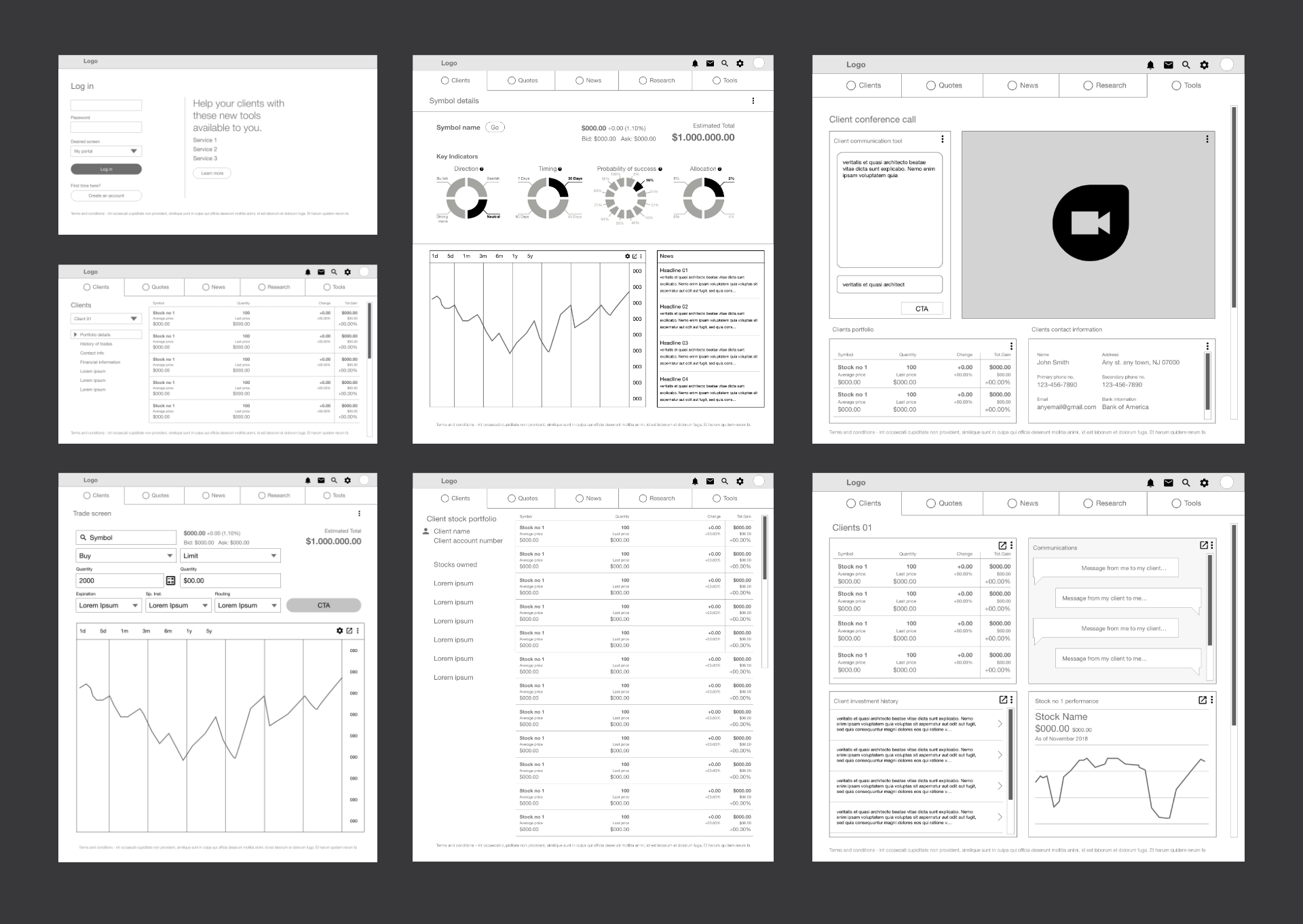
Low-Fidelity Wireframe
I created the low-fidelity wireframes in order to capture all the necessary elements and features which were relevant to my persona (Robert), these wireframes were then presented and tested for usability and cohesiveness.

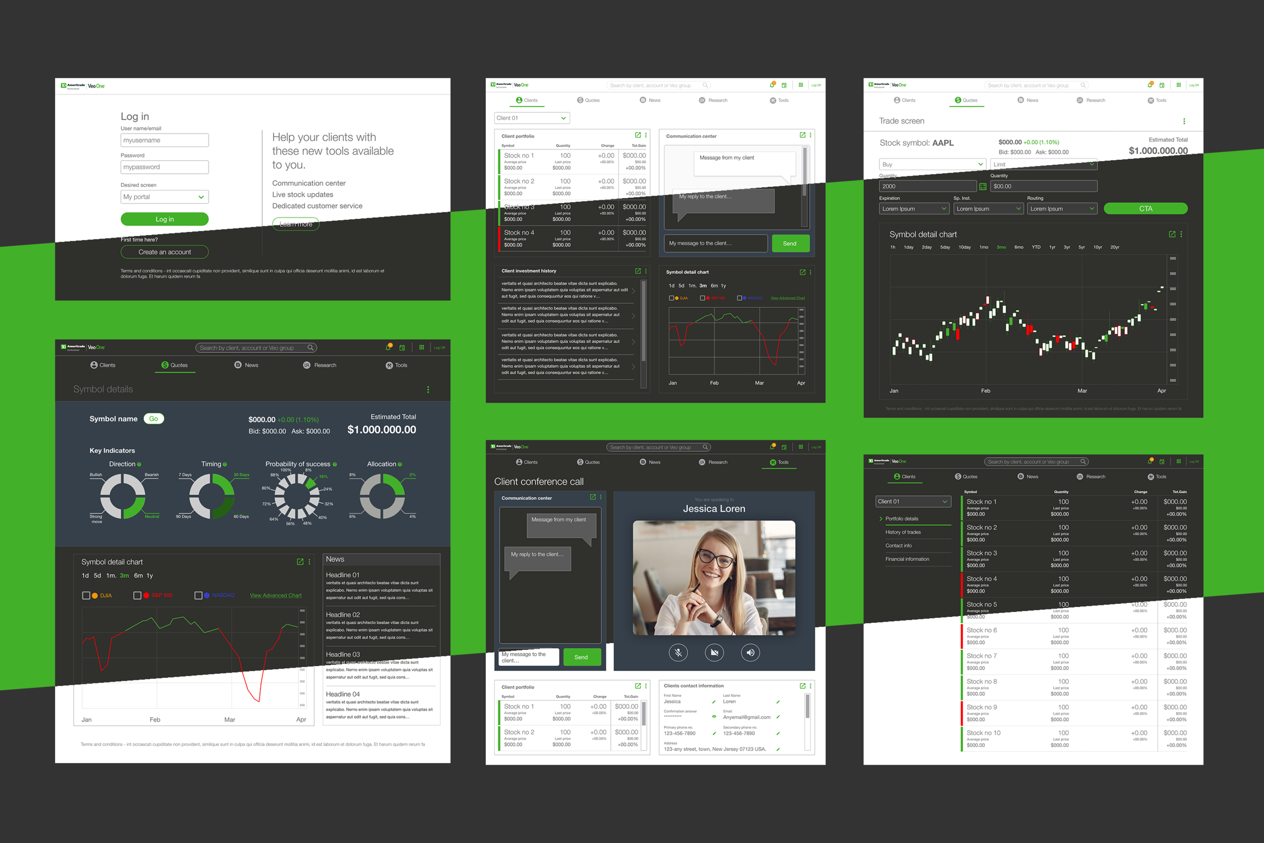
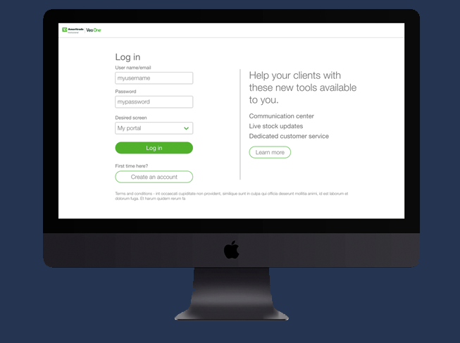
High-Fidelity Screens
I created the high-fidelity screens that included TD Ameritrade branding and approved UI elements which then were tested by multiple users, these users came back and gave us feedback which I then turned into needed updates to the final prototypes.


