New Jersey Courts
The Challenge
Create a tool that can be easily shared between divisions, it needs to be easy to access, robust, and all within the confinements of the PEGA infrastructure.
NJCS is in charge of all digital tools relate to the state judiciary system. Judges, attorneys, defendants, law enforcement, and volunteers use it in their day-to-day operations. All of these users rely on a consistent experience to make the process as smooth as possible.
Empathy Map
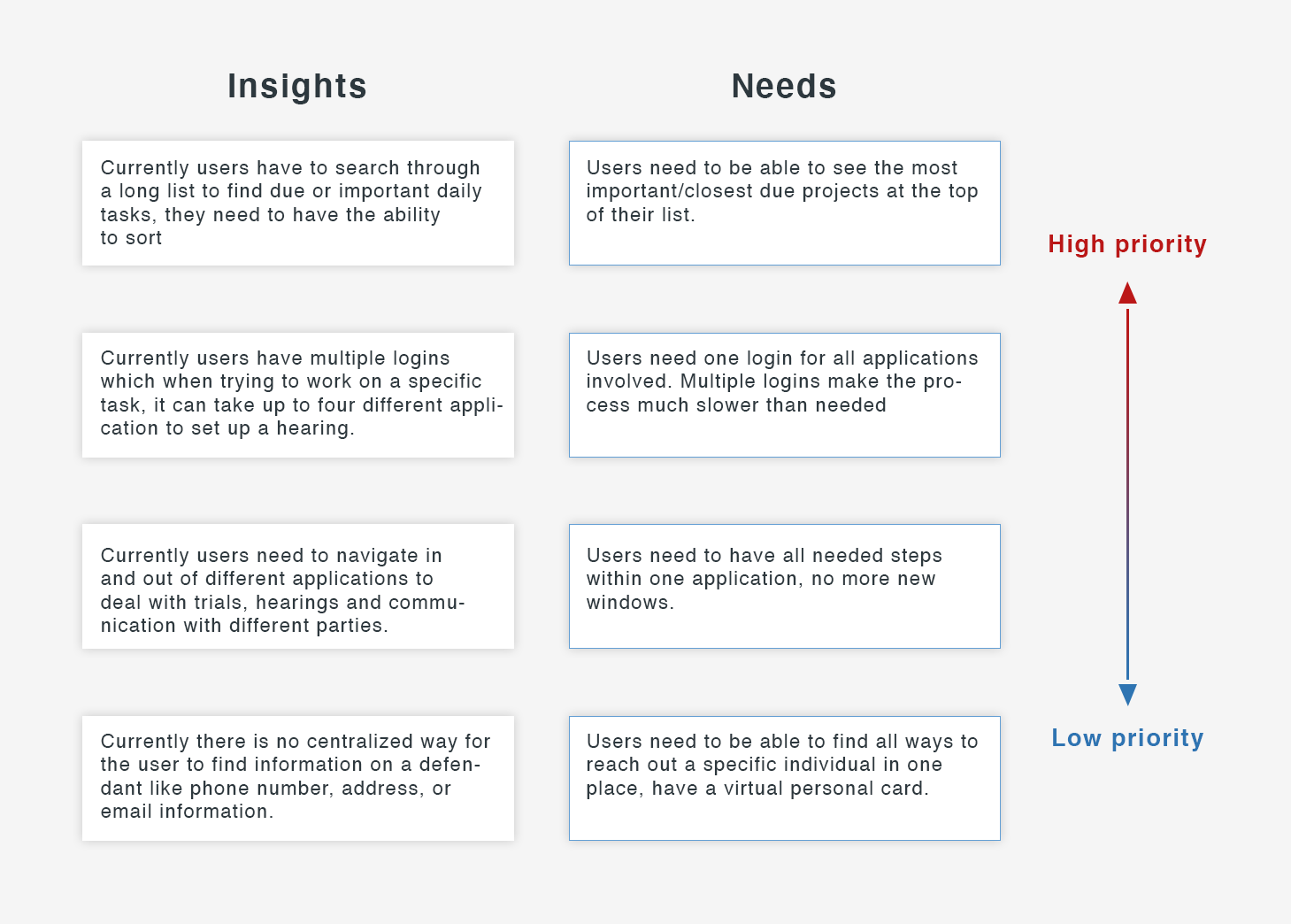
After translating the qualitative data into insights about the user needs, I was able to understand that state employees genuinely want to help their community. However I also identified some barriers preventing them to do so. Below empathy map findings clearly indicate what are the challenges they are having which translate into the user needs of NJCS target user.
Define Persona
To represent the data from the empathy map, I created the persona “Valorie”. By giving context and personality to the research data, we can better empathize with the target user throughout the design process.
"I wish there was a consistent way to navigate from application to application, I spend too much time trying to search for the information I need." - Valorie
Requirements
Considering the most valuable points from the user interview, I ended up with these points to solve. I underwent a rapid brainstorming activity and chose features to prioritize for each Valorie’s needs to select features based on feasibility and effectiveness.
Questions asked before the project started
What problem are we solving?
Make day to day tasks easier to find.
Why are we solving this problem?
The users complaint of too much time to find their tasks.
What is the desired result?
To have one place for court staff to find all due tasks.
User story (Actor - Verb - Object)
Court staff - reviews - his/her tasks.
Is this project a reaction to user comments or complaints?
Yes, the user complaints of confusing interface.
Who are we designing for, who is our audience?
We are designing for Court staff primary.

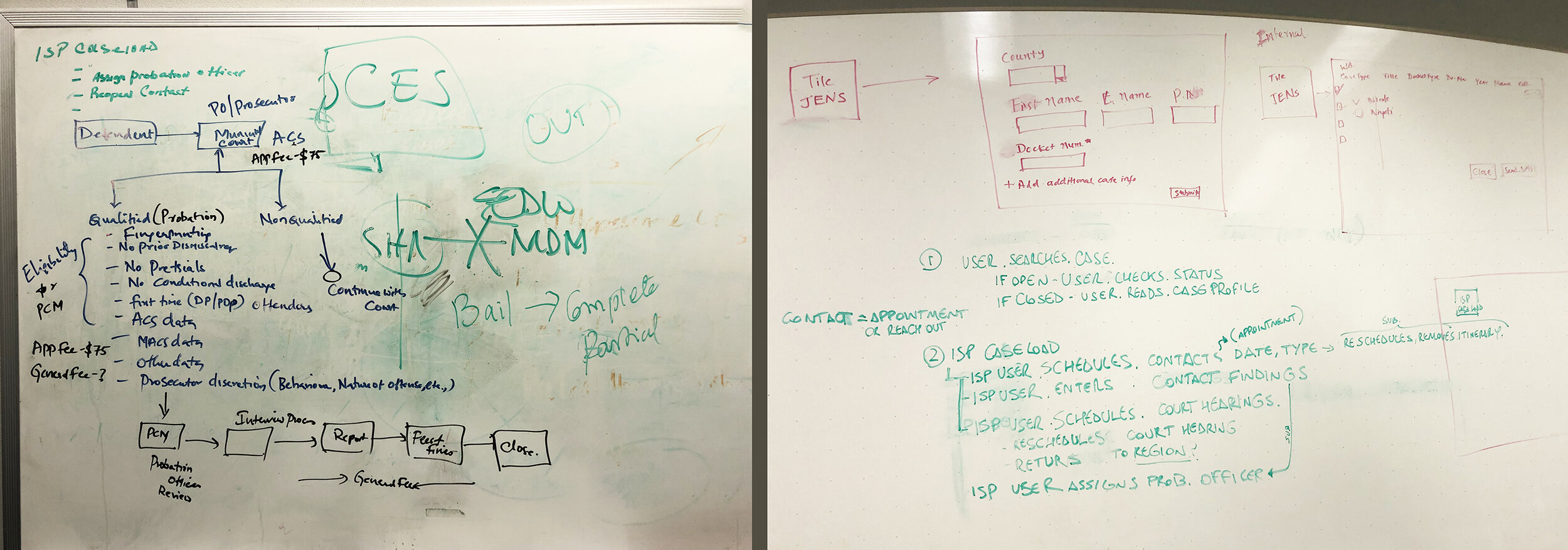
Whiteboarding sessions
In order for us to understand the different use cases, how these connected and interacted together many whiteboarding sessions took place where pain points and redundancies were identified. It helped me then be able to go back and create a concise wireframe and user flow.
Biggest pain points
Sitemap
Then I created a sitemap in order to visualize the information architecture of the application. From studying the previous software that Valorie had to use, a challenge for me was how to organize the most common features or her day-to-day tasks. To overcome this, I analyzed the patterns and empathized with my persona, Valorie. This allowed me to identify the most intuitive way to structure the application. Then I employed the card sorting method to improve and verify the information architecture and navigation of the app.
User Flow
To analyze the flow throughout the application, I mapped out user flows that were based on a whole storyboard and by examining the sequence of user actions for each scenarios showed the relationships between screens. This process gave me a better sense about how to craft intuitive experiences through the UI.
Sketches
I started designing the UI with new features by roughly sketching out ideas. Then I made clearer versions of the sketches. This sketch process helps to share my ideas with peers/mentors to gain constructive feedback at an early stage of the design.
Low-Fidelity Wireframe
I created the low-fidelity wireframes in order to capture all the necessary elements and features which were relevant to my persona (Valorie), these wireframes were then presented and tested for usability and cohesiveness.
High-Fidelity Screens
I created the high-fidelity screens that included branding and PEGA system approved UI elements which then were tested by multiple users, these users came back and gave us feedback which I then turned into needed updates to the final prototypes.


