Hertz Rent a Car Reservation Process
The Challenge
Create an experience that will simplify how most of our users rent a car.
The challenge was having to re-envision how 75% of our customers rent a car, how to simplify and make the experience consistent throughout the different socio-economic, cultural, and regional differences between our customers. Another thing to consider was the type of rental, whether they were leisure or business-oriented, weekend or week rentals. All of these challenges need to be considered when designing the rental experience.
Empathy Map
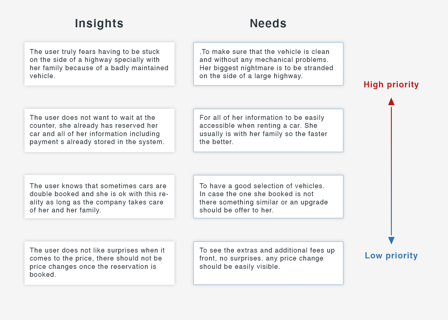
After reviewing the quantitative and qualitative data, we were able to pin point our users needs and wants much better. How price and extras as well as discounts matter most to a family but speed, consistency and time at the counter matter more to the business/corporate client. However we also found major pain point which we looked to address on this design. Below empathy map findings clearly indicate what are the challenges they are having which translate into the user needs of this Hertz target audience.
Define Persona
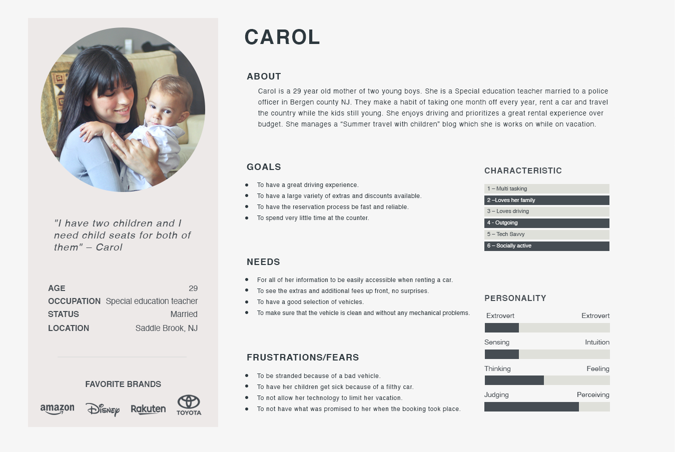
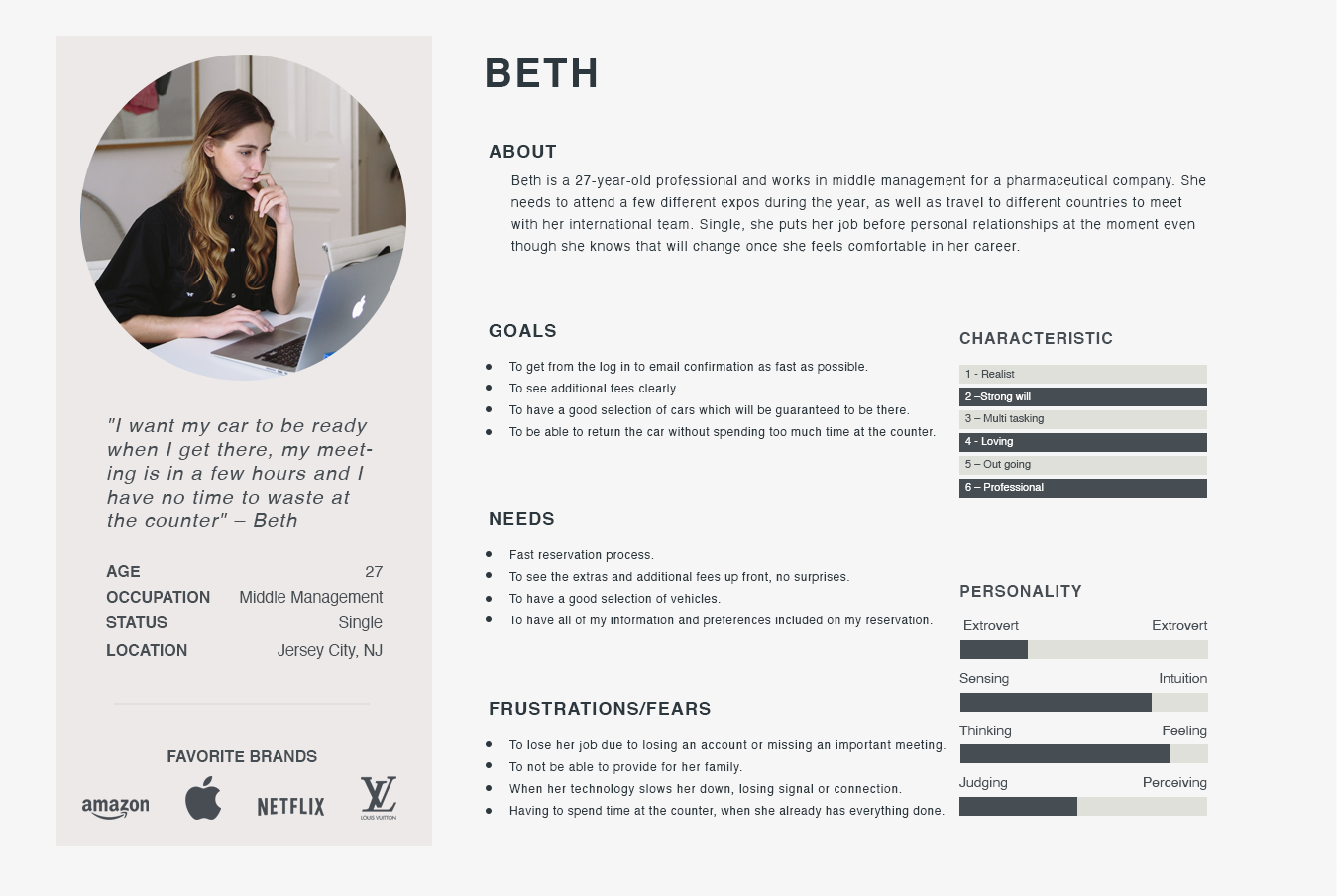
To represent the data from the empathy map, I created two personas “Carol” (Leisure) and Beth (Corporate). By giving context and personality to the research data, we can better empathize with the target users throughout the design process.
"I have two children and I need child seats for both of them" - Carol
"I want my car to be ready when I get there, my meeting is in a few hours and I have no time to waste at the counter" - Beth
Requirements
Considering the most valuable points from the users interviews, we ended up with these points to solve. I underwent a rapid brainstorming activity and chose features to prioritize for each of Carol and Beth’s needs to select features based on feasibility and effectiveness.
Questions asked before the project started
What problem are we solving?
Simplify the reservation process.
Why are we solving this problem?
Many pain points were users would give up.
What is the desired result?
For most users to have a positive experience renting a car.
User story (Actor - Verb - Object)
Users - rent - a vehicle
Is this project a reaction to user comments or complaints?
Yes, users wanted a simpler way to rent a car.
Who are we designing for, who is our audience?
We are designing for the vast majority of our clients

Biggest pain points
Sitemap
Then I created a sitemap in order to visualize the information architecture of the website. From studying the way our users rented cars in the past, a challenge for me was how to improve their experience. To overcome this, I analyzed the patterns and empathized with my personas, Carol and Beth. This allowed me to identify the most intuitive way for my client to get the car and go.
Sketches
I started designing the UI with new features by roughly sketching out ideas. Then I made clearer versions of the sketches. This sketch process helps to share my ideas with peers/mentors to gain constructive feedback at an early stage of the design.
Low-Fidelity Wireframe
I created the low-fidelity wireframes in order to capture all the necessary elements and features which were relevant to my personas (Carol and Beth), these wireframes were then presented and tested for usability and cohesiveness.

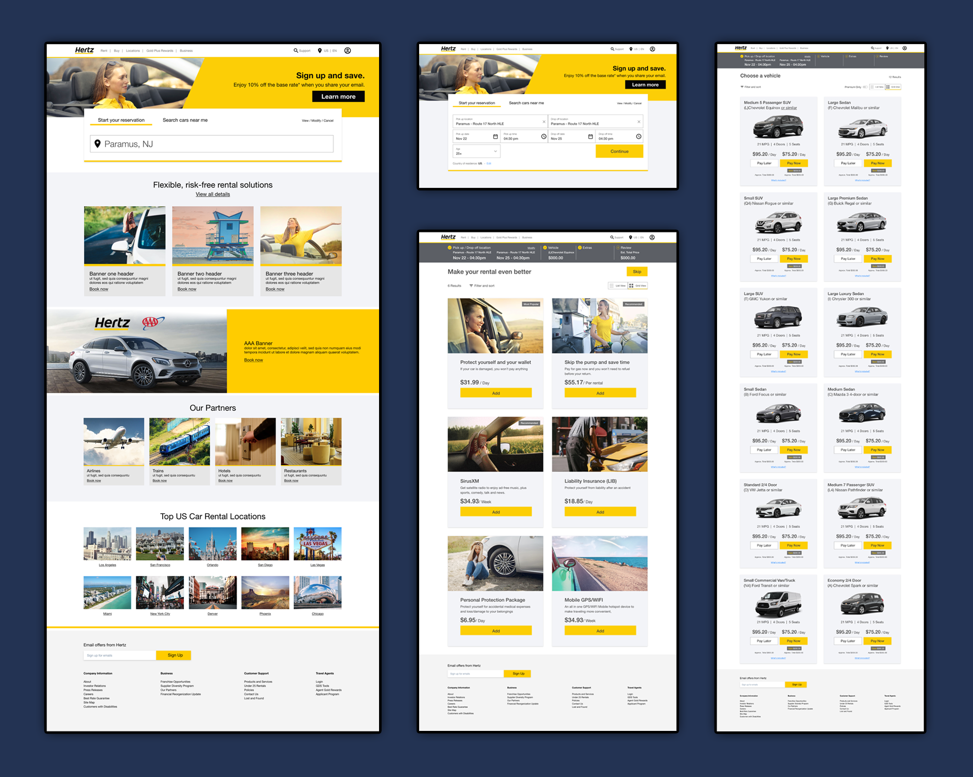
High-Fidelity Screens
I created the high-fidelity screens that included branding and Hertz approved UI elements which then were tested by multiple users, these users came back and gave us feedback which I then turned into needed updates to the final prototypes.


