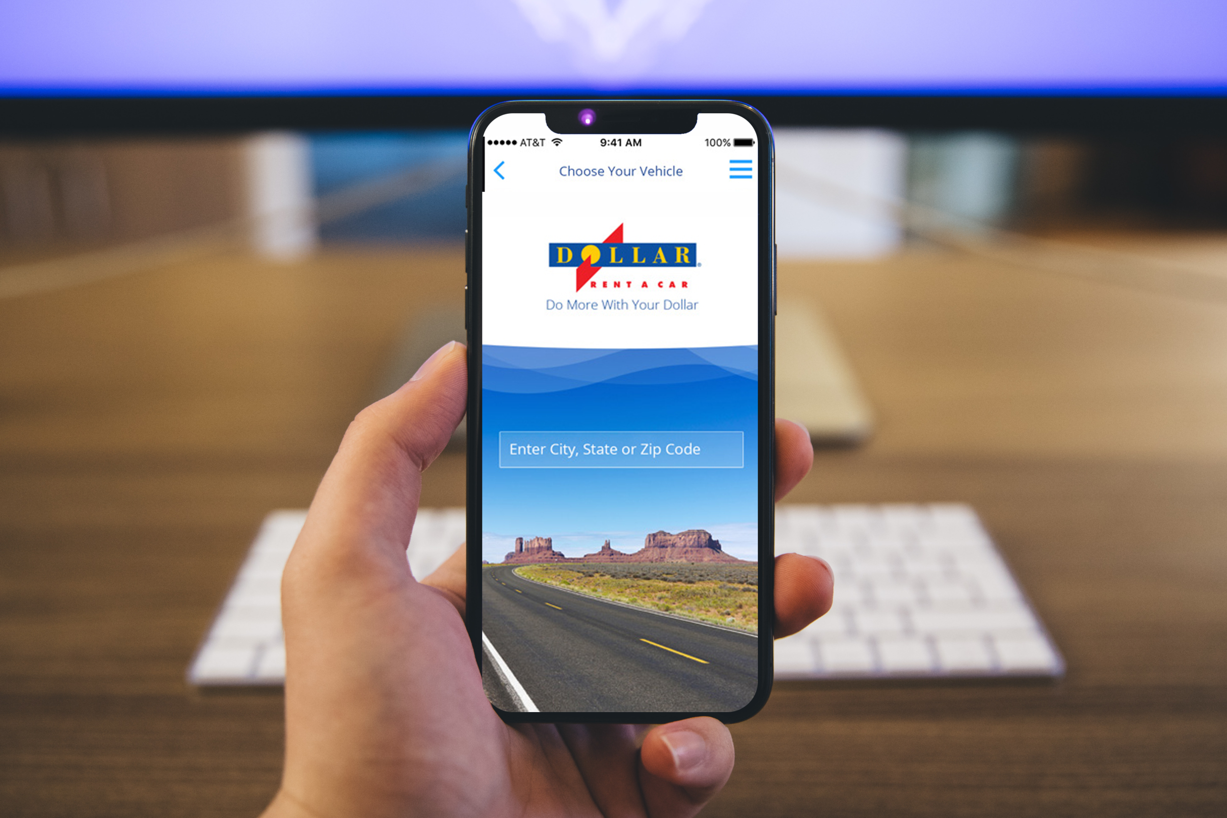
Dollar Car Rental IOS application
The Challenge
Create an IOS application that would cater to driving enthusiasts.
The challenge for this application was to make sure that it would work with driving enthusiasts while using the Hertz IOS application as the backbone. We had to separate both applications as much as possible while integrating the backend systems and databases.
Empathy Map
After reviewing the data gathered from a group of highly active car renters, I was able to understand their needs and wants much better. How the two most valuable and appreciated features for variety and the driving experience. these were at the top of their list. However, I also found major pain points that I looked to address on this design. Below the empathy map findings clearly indicate what are the challenges they are having which translate into the user needs of this Dollar IOS app target user.
Define Persona
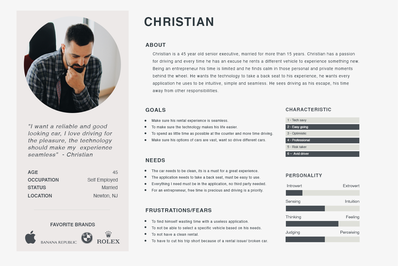
To represent the data from the empathy map, I created the persona “Christian”. By giving context and personality to the research data, we can better empathize with the target user throughout the design process.
"I want a reliable and good looking car, I love driving for the pleasure, the technology should make my experience seamless" - Christian
Requirements
Considering the most valuable points from the user interviews, I ended up with these points to solve. I underwent a rapid brainstorming activity and chose features to prioritize for each of Christian’s needs to select features based on feasibility and effectiveness.
Questions asked before the project started
What problem are we solving?
Clients want a simpler way to rent a specific vehicle.
Why are we solving this problem?
We want to provide a better experience for users.
What is the desired result?
For the user to have a quick and simple way to book a car.
User story (Actor - Verb - Object)
Client - books - a vehicle
Is this project a reaction to user comments or complaints?
No, this is a new application - a way to have web presence.
Who are we designing for, who is our audience?
Clients who want a more personal experience.

Biggest pain points
Sitemap
Then I created a sitemap in order to visualize the information architecture of the application. From studying the way Christian rented cars in the past, a challenge for me was how to improve his experience. To overcome this, I analyzed the patterns and empathized with my persona, Christian. This allowed me to identify the most intuitive way for my client to use the application.
Sketches
I started designing the UI with new features by roughly sketching out ideas. Then I made clearer versions of the sketches. This sketch process helps to share my ideas with peers/mentors to gain constructive feedback at an early stage of the design.
Low-Fidelity Wireframe
I created the low-fidelity wireframes in order to capture all the necessary elements and features which were relevant to my persona (Christian), these wireframes were then presented and tested for usability and cohesiveness.
High-Fidelity Screens
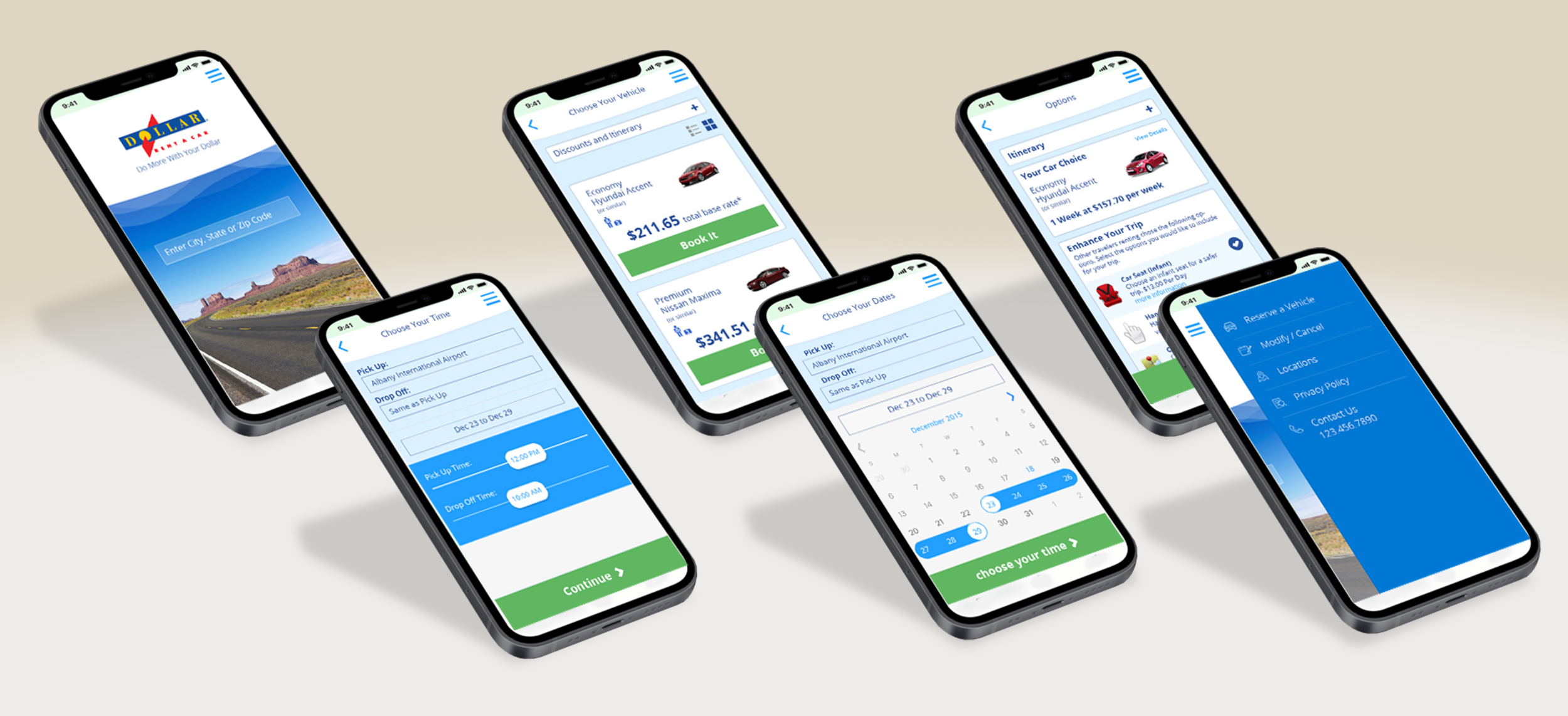
I created the high-fidelity screens that included branding and Dollar approved UI elements which then were tested by multiple users, these users came back and gave us feedback which I then turned into needed updates to the final prototypes.


