Babies R Us Registry
The Challenge
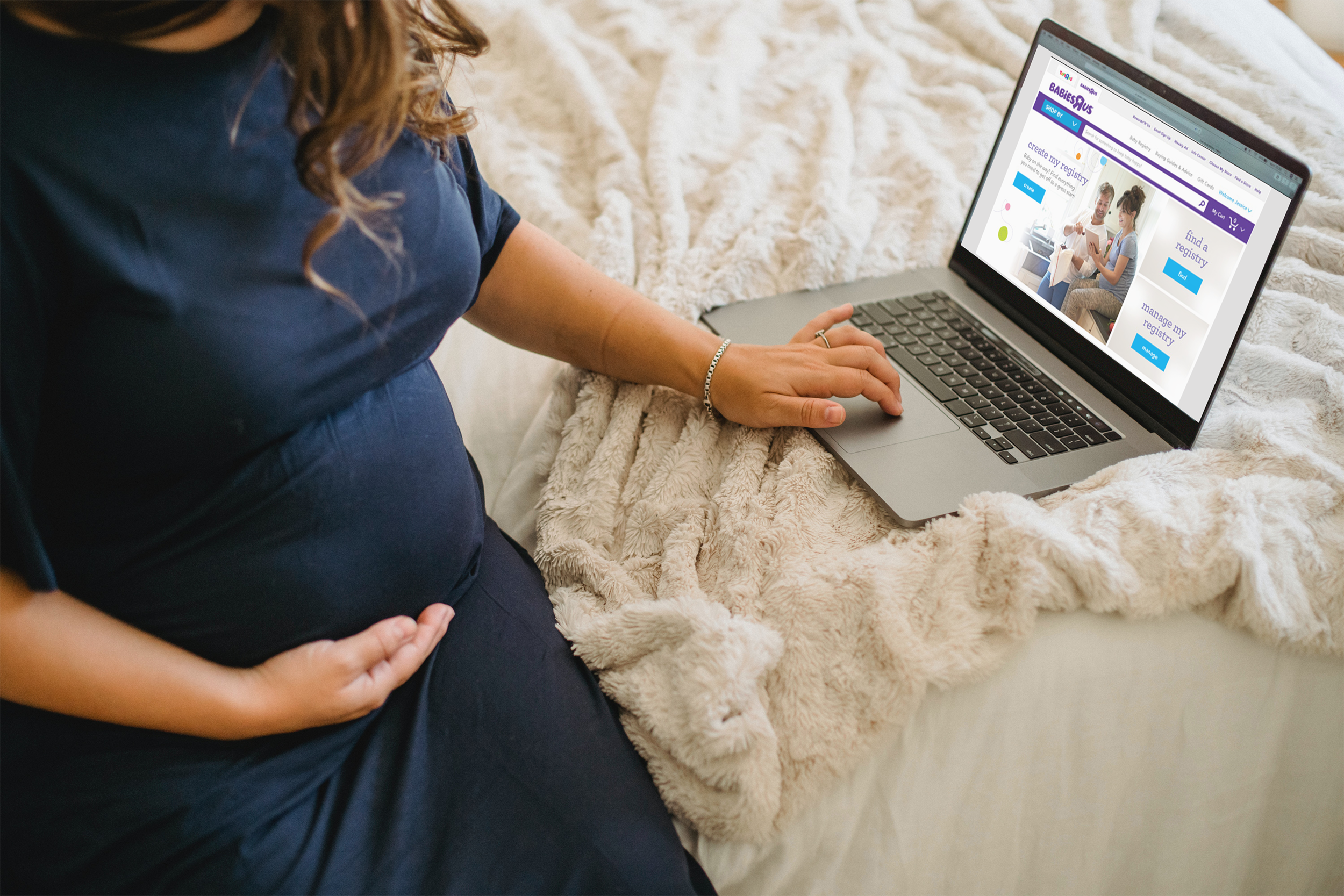
Create an enticing registry experience for expecting families.
The challenge for this project was to create an enticing, simple and attractive registry experience that would focus on making the user not notice the technical limitations and focus on what matters, the simple act of choosing items necessary to take care of a newborn.

Empathy Map
After reviewing the data gathered from customers reviews and interviews, the quantitative and qualitative data allowed me to understand their needs and wants much better. How the two most valuable and appreciated features for a pregnant mothers are an easy registration process and having all desired items easily and readily available for selection.

Define Persona
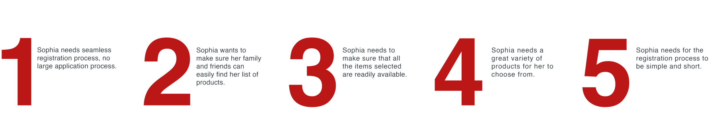
To represent the data from the empathy map, I created the persona “Sophia”. By giving context and personality to the research data, we can better empathize with the target user throughout the design process.
"I want the registration process to be short, why do I have to spend over ten minutes entering information… Amazon is so much easier" - Sophia.

Requirements
Considering the most valuable points from the user interviews, I ended up with these points to solve. I underwent a rapid brainstorming activity and chose features to prioritize for each of Sophia’s needs to select features based on feasibility and effectiveness.
Questions asked before the project started
What problem are we solving?
To make streamline the process of creating a registry.
Why are we solving this problem?
Currently there are multiple pain points where users give up.
What is the desired result?
To simplify how parents can create and modify a registry.
User story (Actor - Verb - Object)
Expecting mother - creates - baby registry.
Is this project a reaction to user comments or complaints?
Yes, its a reaction to user’s complaints and comments.
Who are we designing for, who is our audience?
Expecting mother and parents in general.
Biggest pain points
Sitemap
Then I created a sitemap in order to visualize the information architecture of the application. From studying the way Sophia tried to create a registry, a challenge for me was how to improve her experience. To overcome this, I analyzed the patterns and empathized with my persona, Sophia. This allowed me to identify the most intuitive way for my client to create a registry that she can then share with her loved ones.

Sketches
I started designing the UI with new features by roughly sketching out ideas. Then I made clearer versions of the sketches. This sketch process helps to share my ideas with peers/mentors to gain constructive feedback at an early stage of the design.

Low-Fidelity Wireframe
I created the low-fidelity wireframes in order to capture all the necessary elements and features which were relevant to my persona (Sophia), these wireframes were then presented and tested for usability and cohesiveness.

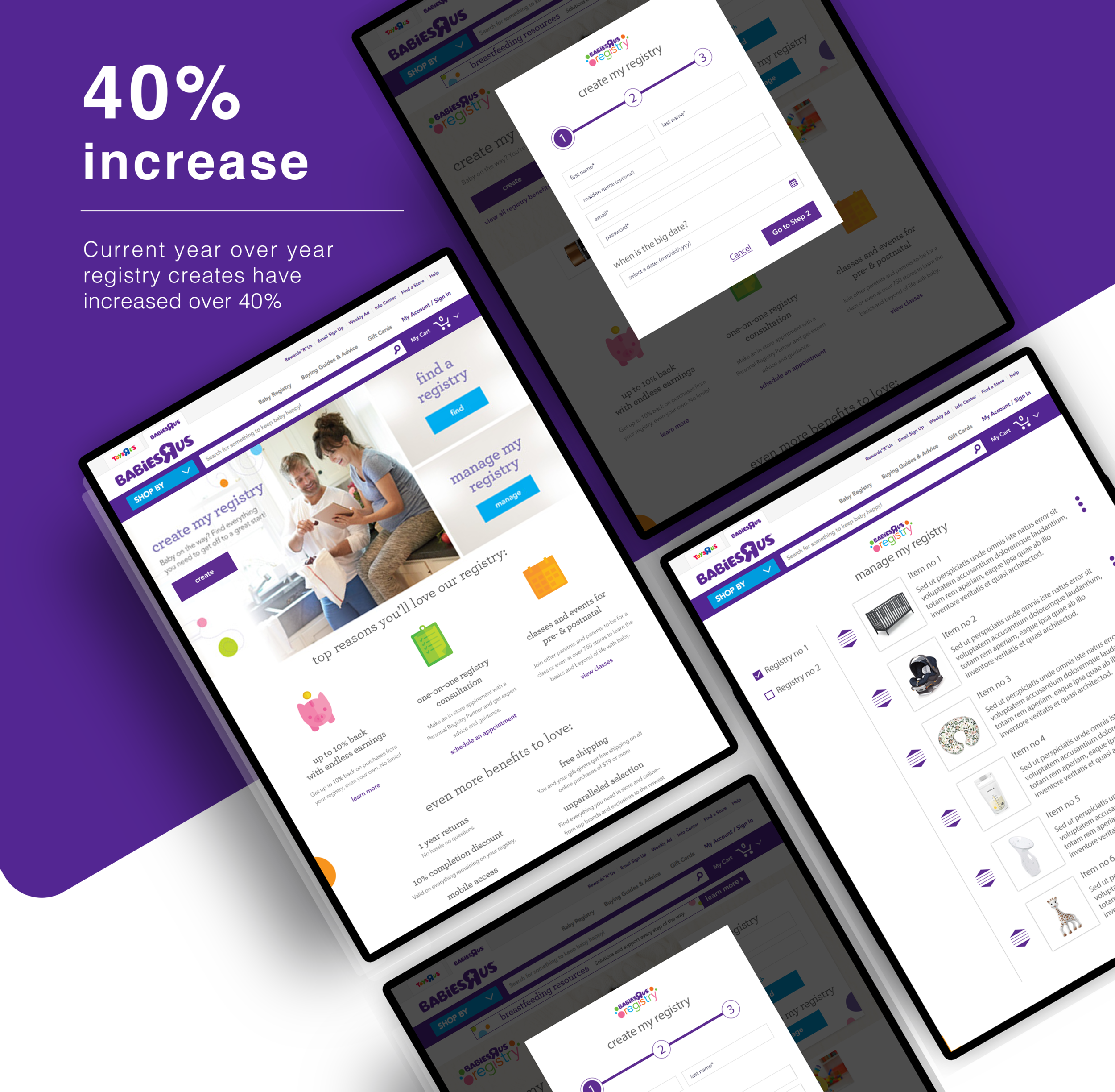
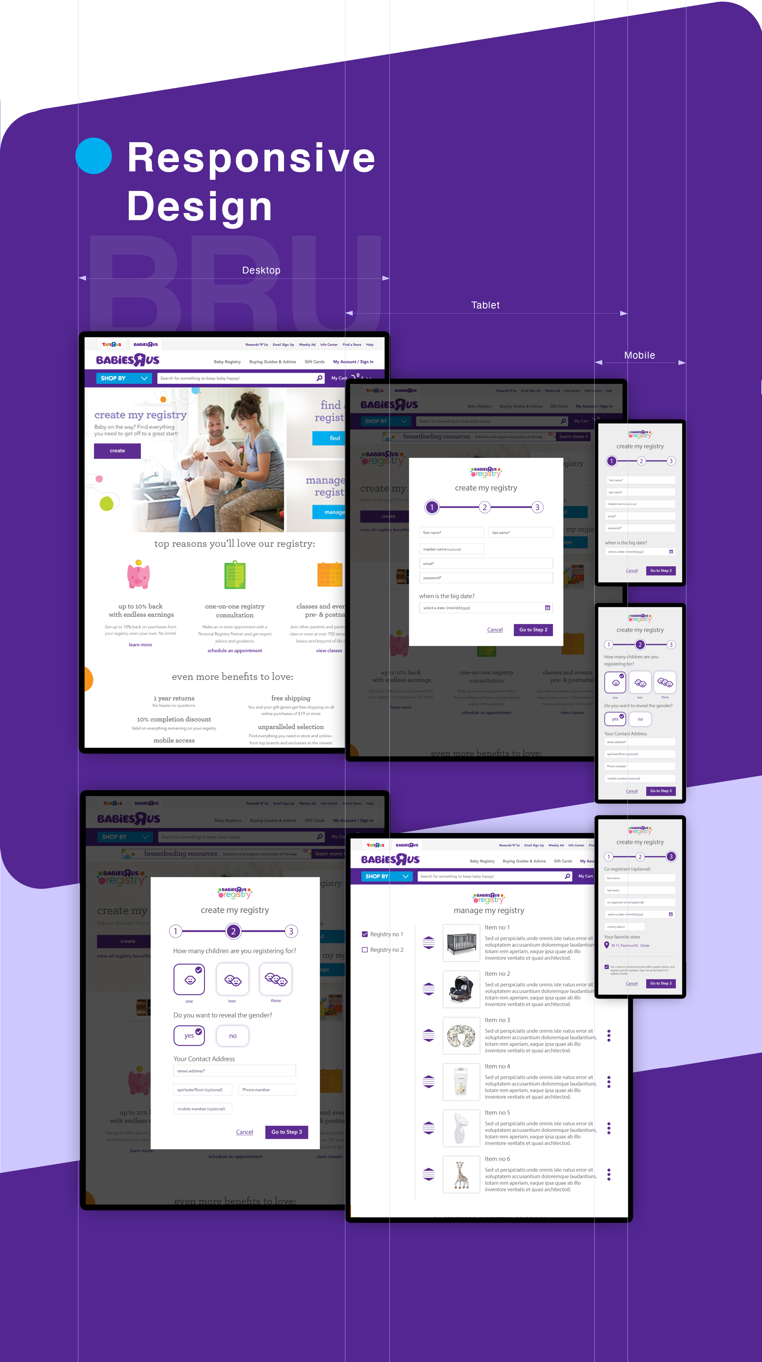
High-Fidelity Screens
I created the high-fidelity screens that included branding and Babies R Us approved UI elements which then were tested by multiple users, these users came back and gave us feedback which I then turned into needed updates to the final prototypes.